Gacha eats

A new way to discover places to eat!

Food Discovery Mobile App

Specificiations

Overview

Gacha Eats makes it simple and narrows down some key options and suggests the user a restaurant to go to. This is based on the options the user has selected, making the experience a surprise.

Our food app will introduce users to new places to eat at which will affect users who are indecisive or not sure what they want to eat by suggesting a new restaurant to try out. Will will measure effectiveness by tacking check-in and accumulated tokens earned through these food adventures.

Responsibilities & Tools

User Research, Prototyping, UI Design, Figma, Photoshop, Freelance

January - March 2020

Conclusion

The Solution

Users select a few options and the app will select a location. Inspired by the concept of gachapons found in japan, users will get a randomly selected location to eat at. This also helps out restaurants by introducing new customers. In order to keep users coming back, the app also has a kickback system, where users can earn tokens and redeem discounts on their next meal.

Choices...

"Where do you want to eat?"

Eating out or simply looking for something to eat can always stop us in our tracks. There is no simple answer as there are so many places to eat at.

As people we like to play it safe most of the time and go back to the places we know that are good, this is where it starts to become dull and boring. We either get recommendations from friends or see something interesting on social media, but rarely do we go out on a whim to try something new. This is where the Gacha Eats creates a new adventure for you.

Gacha Eats Objectives
  • Takes the guess work away from the users, and introduces them to new places to eat at.
  • Create a unique experience where both parties benefit from one another. 
User Research

Survey Studies

There are many reasons to eat out but one of them is socializing, we enjoy the company of others and having a meal together creates a great time for bonding. Some interesting findings in online survey showed that people tend to eat out quite often.

  • 56% of American's dine out at a restaurant.
  • 10 percent said they eat out 4 to 6 times a week, and 6 percent said they eat out everyday.
  • The average American household spends about $3,000 a year dining out.
  • Younger people are more often to eat out then their older counterpart.

Interview Insights

In order to get a better understanding of what factors affects our choices, I asked a few friends about why they eat out, and how do they decide where to eat? And here are some key takeaways:

  • They usually go to places due to photos from social media.
  • Looking to try something new, and willing to travel.
  • The atmosphere and what the location has to offer.

Competitive Analysis

I looked into common apps that users use to find food places to eat at. While there aren't any randomizers for looking for places to eat at, these apps do offer users suggestions.

  • All apps allow users to take photos, share them and has GPS information.
  • Yelp and Trip advisor have reviews and ratings of restaurants.
Yelp

Yelp is a social site for everything local. Using Yelp, one can find nearby restaurants, bars, shops, etc., read reviews customers left for businesses, and write reviews with ease. Great for foodies looking for suggestions nearby.

Features: Search, Suggestions, Photos, Share, Reviews, Categories, Ratings, GPS Location, Profile Page, Explore
Trip Advisor

Location specific when searching for restaurants, lacks impact, but straight to the point. A research platform aggregates reviews and opinions of members about destinations, accommodations, restaurants and activities throughout the world.

Features: Search, Suggestions, Photos, Share, Reviews, Ratings, Categories, Explore, GPS Location, Profile Page
Instagram

Quick and fast way to share food photos, No real way to review or sort restaurants. But may entice users to look up the locations. You can take, edit, and publish visual content for your followers to interact with thorough likes, comments, and shares.

Features: Search, Hashtags, Photos, Share, Social Media, Phot filter, GPS Location, Achieves, Livestream

Personas

Through my research and interviews, I learned a lot of about who my users are. I wanted to further empathize with them, so I developed a persona with similar characteristics and pain points as my users. This is Kevin and he's foodie kind of guy or tries to be, but gets stumped when asked "Where do you want to eat?".

Ideation

App Map

So how does this app work? In order to get a better understanding, I created a app map and listed all its function from the main to the subs. I wanted to keep the end user's in mind, and provide an enjoyable experience.

User Flow

Here are two possible scenarios that highlight the features that Kevin may experience when using the app.

Sketches

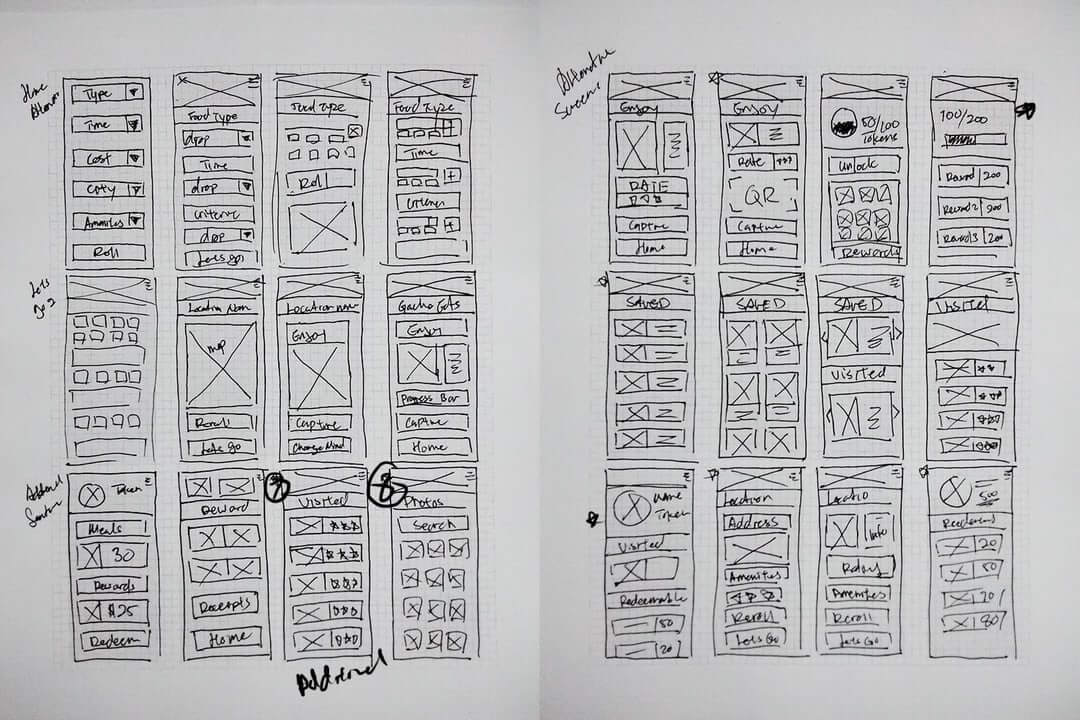
Sketching helped with laying out the ideas and how I want to build this prototype. I also looked back and examined my app map to see how each screen would flow and connect. There were some challenges that I encountered, for example the receipt logging screen, I had to test a few ideas and I was able to pick one and iterate on it.

Lo-Fidelity Wireframes

I decided to focus on the core functions of the app, and created lo-fi wireframes based off my sketches, this gave me a better idea of how this gacha system would function. While laying out the frames, I tested and merged a few options that I thought where good and thought about how the user's experience would be. The next steps is to test this with some friends and to make further changes to improve the experience.

Usability Study and Revision

Study Type: Unmoderated Usability
Study Location: United States, Remote ( Home )
Participants: 5 participants, each completing the study individually.
Duration: 5-10mins based on prompt

  • The starting home page is too confusing, users weren’t sure where to start.
  • No location input for users.
  • Users weren’t sure what to do once the suggested restaurant appeared.
  • The restaurant suggestion doesn’t have enough information or appeal.
  • The receipt tracker is frustrating for some users.


The information I uncovered helped me rework my screens to provide a better experience. I re-examined these pain points and put myself in my user’s shoes. I wanted my user’s to have a clear goal that made sense and that would keep them on track.

  • Rework onboarding process.
  • Added location input for users.
  • Removed map section, app is not used for directions.
  • Reworked restaurant suggestion page, removed map.
  • Replaced receipt capture with QR instead, easier for data entry and tracking.
  • To access QR scan, users are required to have an account. User Registration option added.
  • Simplified rewards/points page as it was too cluttered.

Further Testing and Revision

Study Type: Unmoderated Usability
Study Location: United States, Remote ( Home )
Participants: 5 participants, each completing the study individually.
Duration: 5-10mins based on prompt

  • Homepage is still overwhelming for some users.
  • Onboarding is helpful, but users may forget how functions work later.
  • Suggestion of the day would be nice to have for a quick pick.
  • Buttons and banners look identical, which leads to some confusion.
  • Icons listed can be ambiguous, would like to see tags for each item.
  • No option to search past receipts makes sorting hard.
  • Re-Roll only limited to 1? Some want more rolls.


The revision focused on the gacha system as the previous set up was too complicated and some of the users got lost along the way. The update makes it easier to navigate and get to the end point of finding a restaurant to eat at. Even if the user revisits the app later on, the task is easily completed without a refresh to the onboarding.

  • Simplified home page so users can easily naviage to what they need.
  • Added in a menu tab instead of sliding hamburger menu.
  • Added suggestion section for quick recommendations of the day.
  • Gacha section now has a "My List" and "Last Visited" option instead of a pop up.
  • Reworked gacha system with steps.
  • Added tags to each of the categories to help with identification.
  • Added in search function for receipts.
  • Reworked Profile to better reflect design guidelines.
  • Allow user to choose between 1 or 3 rerolls or have options where users can exchange tokens for more rolls.

Revision Comparison

User testing and feed back helped redefine the overall look of the final design. Instead of having the gacha function on the home page, it is now split into sections. This allows for a more intuitive experience for those that revisit the app later on or letting a friend use it for the first time.

design

Logo and Branding

The creation of the logo was based off the gacha capsule. I explored different ways of how I could make it playful and still have some aspects of food included into it. What do people think about when food comes to mind? A fork and spoon for me, but how would this work? I did some sketching and developed a mascot.

I wanted to choose a color that was refreshing and went with orange, for the complementary colors I went with gray and white. The colors worked really well to help balance the look and give enough contrast for the menus and texts shown in the app.

Gacha Eats Mobile App

Final Design

Randomize your food journey and try something new.

visualize

Hi-Fidelity Wireframes

Bringing it all together, I transformed my wireframes with visuals that encapsulates a fun experience for foodies who are looking to venture out and try something new.

Gacha Options

The gacha system revolves around randomized options where the user can check off what they would like on the day of. These options will get shuffled on a daily basis, and this allows the experience to be fresh. New options will be added over the course of time, and allow users to further enjoy what's out there when looking for a place to eat.

Reroll System

The reroll option allows the user to get a few more options, but still keeps it minimal. Adventurous user's can opt for 1 reroll in settings or allow for 2 rerolls for those that would like a few more options. If the user does decide to reroll, they can check the past options in the "See My Options" tab after all rolls have been used. They can then decide where they want to eat at.

Gacha UI Kit

A sticker sheet of assets used for Gacha Eats.

Accessibility Considerations

Designing for inclusion

My thoughts

Reflection

The most challenging part about this project was setting up the main features of Gacha Eats, which was the randomizer. How could I make it easy to understand and provide a fun experience? I learned to take a few steps back and try to envision it as a story from each step, and that helped me piece together the flow. The user feedback was another important aspect, I’ve shared this app idea with a few friends and they also agreed that figuring out what to eat on a daily basis can be a challenge. Having this app make suggestions based on a few tags a user selects is a great way to find new locations and to try new things.

The app helped indecisive user’s figure out what to eat and it also introduces them to new places to eat. The second effect of this app is that it introduced new customers to restaurants which in turn boosts revenue.

This project was quite the journey and a fun one, I had no idea how it would all come together, but seeing the final results was quite fulfilling. Through user testing, I was able to identify pain points and make changes accordingly, my solution opened new doors for users and restaurant owners. Users could visit new places to eat, and restaurants will gain new customers. And to further motivate users to continue using the app, the kick back system would keep the cycle going. User's redeem tokens, which they can spend it later for a discount or a free meal.

Next Steps

The experience doesn't end here, these are somethings I'd like to continue on with.